Stained Unravel
NFT series; Nguyen Wahed in collaboration with Interface Gallery, New York, April 2026. Central work in the Senescenence exhibition.
Stained Unravel is a cellular automaton series in the tradition of Conway's Game of Life — but a different system category. Where Conway prescribes a minimal set of rules to determine if a cell lives or dies, Stained Unravel has an extended vocabulary: 23 morphological states cells can inhabit, operated on by three mechanisms that produce birth, survival, and death as consequences rather than rules (→ 3000, 3001).
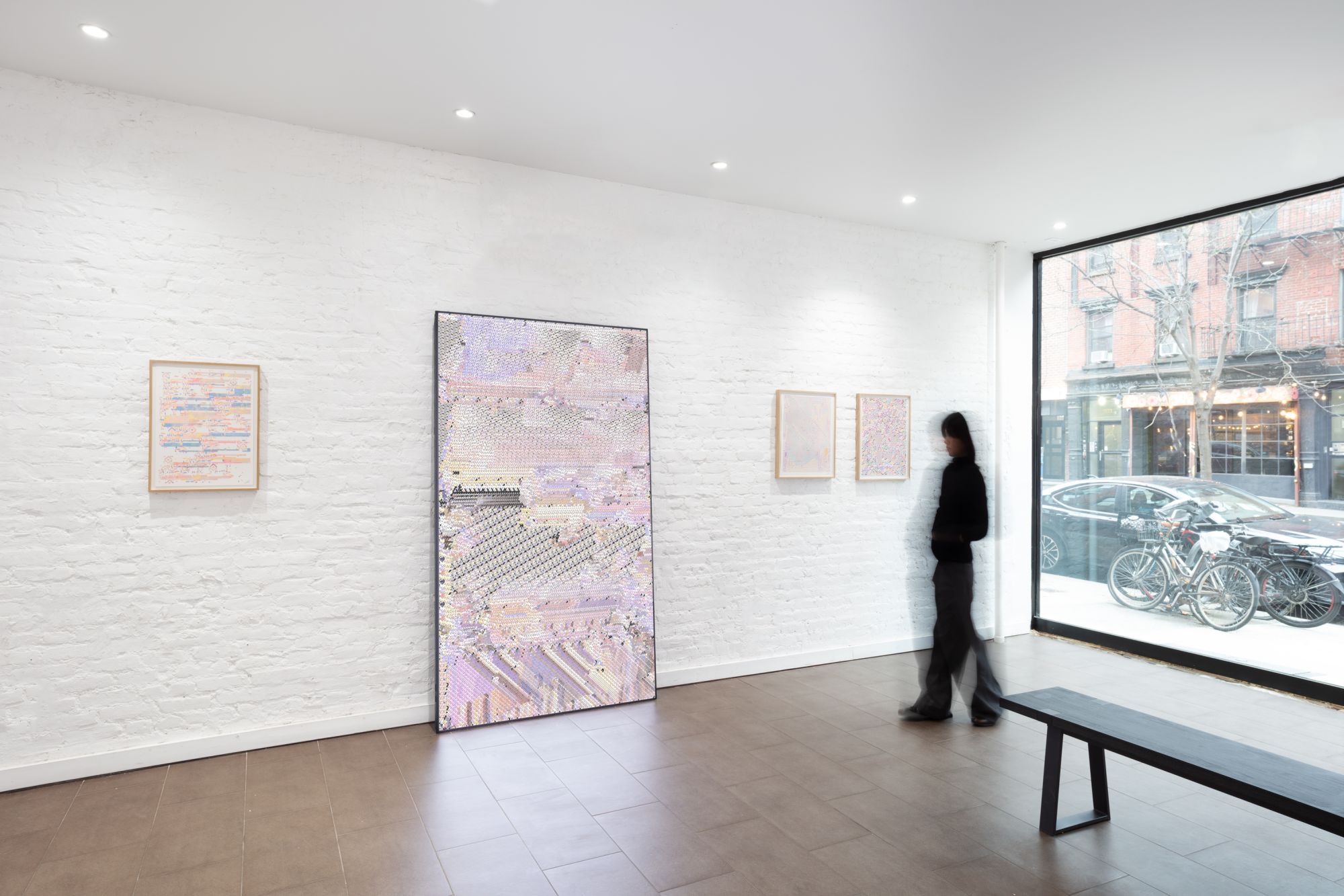
The Senescenence exhibition presents the work in two forms, shown together at Nguyen Wahed (in collaboration with Interface Gallery): the animated NFT series, where the cellular automaton runs in real time on screen; and plotter drawings on paper, which trace outputs of the same generative logic into a different medium. These two forms are distinct executionally — the animated work renders its geometric shapes directly; the plotter drawings require a separate set of algorithms that convert those shapes into hatching, because a plotter can only draw lines.
The seven works
Each of the seven works in the series has its own hand-made palette tied to its title. The palette determines the colours cells can inhabit and the start and end colour of each staining transition. The result is that while all seven share the same rule-set and the same 23-state vocabulary, they look like different worlds — each palette shaping the character and emotional register of what the cellular automaton produces.
Spring.
Medium grey ground. Four distinct gradient transitions animate the field: saturated red aging toward saturated blue (passing through violet in between); white aging toward warm amber-gold; pure black aging toward pure white; and teal transitioning to pale blush pink. Large merged groups form diagonal rectangular structures while smaller cells scatter in between — nothing fully settled. The grey is neutral, neither warm nor cold: a ground from which colour erupts. The white-to-amber gradient introduces warmth; the teal-to-blush adds a different chromatic temperature. Spring as emergence, as the moment before full organisation — multiple colour logics in play simultaneously, none yet dominant.
Game.
Pure black ground. Seven gradients animate the field: bright yellow aging toward orange; bright red aging toward deep brick; bright blue aging toward dark navy; and four white-origin gradients fading to medium grey, dusty rose, vivid red, and deep indigo respectively. The result is the most chromatically dense work in the series — a full range from pure white through saturated primaries down to near-black, all against void. Large merged groups form near-rectangular structures; the surrounding field is packed with very small cells in yellow, orange, red, and blue, forming rows and columns of near-crystalline regularity. Conway called his invention the Game of Life; this work inherits that name and literalises it. The rectangular geometry and the dark ground invoke early video game aesthetics — a display, a board, a game in progress.
Night.
Pure black ground. Four gradients produce the field: coral-red aging toward deep electric blue; bright yellow aging toward muted olive green; mint-cyan aging toward red; and white fading to dark grey. The fresh-born cells announce in coral, yellow, and mint — each pair's far end is a darker or shifted hue — so the "neon" quality belongs to the start colours, the stained quality to their aged counterparts. A large diagonal void cuts cleanly from the upper-right quadrant down through the lower-right corner, leaving a triangular emptiness of pure black. The contrast is absolute: vivid colour against total dark, dense life against total absence. Night as a condition of extremes — no middle register. The diagonal cut has an architectural quality: a skyline, a horizon, a shadow falling at an angle across the field. The active region and the dead zone meet at a clean edge.
De Stijl.
Warm off-white ground (a pinkish cream, not stark white). Five gradients, all carrying subtle transitions within a narrow tonal band: near-charcoal aging toward a slightly warmer near-black; warm ochre cycling through a fractionally darker ochre; muted sage green shifting toward a slightly deeper sage; slate blue shifting toward a slightly cooler slate blue; and brick red aging toward terracotta. These are not pure primaries — they are aged, desaturated, historically-sourced values. The palette was distilled directly from the paintings of Bart van der Leck and Theo van Doesburg (ca. 1920) — two De Stijl painters whose chromatic choices read as historical ochres and earth reds, institutional blues, and greyish whites rather than saturated RGB primaries. The reference is therefore precise: not a generic primary-colour abstraction but the specific chromatic values of that movement at a particular historical moment, with their accumulated age and material specificity intact. The irony is philosophical: De Stijl sought the rational ideal through conscious reduction. Here the same visual language emerges from the cellular automaton's rules operating on a palette already distilled from that history. The grid did not require a composing intelligence; it may be latent in any sufficiently rule-governed system given those specific, historically loaded colours.
Stained.
Warm parchment ground — rgb(210,205,183), a yellowish off-white. This background colour is also the end colour of three of the six gradients: white aging toward it, black aging toward it, and a second black-to-cream repeat. The other three gradients move from dark crimson to light grey, dark navy to cool pale grey, and olive green to pale straw yellow. The result is a palette where ageing means convergence toward the ground: the most stable cells become indistinguishable from the background, while fresh and short-lived cells appear in the darks — crimson, navy, olive — before fading back. A large diagonal band of the darkest, most long-held configurations runs from upper-left to lower-right; the paler areas are recently changed. This work takes the series name most literally: the temporal staining mechanism is most legible here because the fully-stained state IS the background — the ground itself is the maximum age, not a neutral substrate. "Stained" names both the mechanism shared by all seven works and the specific palette of this one — a self-describing title within a self-describing series name.
Markov's Dream.
Medium grey ground — rgb(176,176,176), nearly identical to Spring's grey. Five gradients: bright green aging through a very slightly deeper green; hot pink/magenta aging through a very slightly deeper magenta; bright blue aging through a very slightly deeper blue; black aging toward dark grey; and white aging toward near-white. The transitions within each colour are extremely narrow — the gradient is almost a flat tone — meaning the three saturated colours (green, magenta, blue) hold their hue across their entire staining arc, without drifting toward a different hue. What shifts is intensity, not identity. The field is therefore a contest between three unmixed primaries on neutral grey: a bold green band, a magenta field, a blue presence, and traces of near-white and near-black at the extremes. The palette is not arbitrary: these are the same pure saturated RGB primaries first used in Markov's Window (2004) and returned to across two subsequent works before arriving here. This is the fourth instance of that palette, now applied to a cellular automaton. The memoryless palette — from a work named for memorylessness — is deployed in a system whose defining mechanism is memory (temporal staining). The colours that once described how a system forgets now describe how a system accumulates (→ The Markov's Dream Palette).
Mother of Pearl.
Medium grey ground. All five gradients originate from pure white: white aging toward pale lavender; white aging toward warm sandy cream; white aging toward white (no transition — frozen at birth colour); white aging toward pale blush pink; and white aging toward pure black. The structure is therefore asymmetric: four gradients stay close to white, while one crosses the full tonal range to black. Fresh cells appear in pure white regardless of which gradient they carry; only as staining accumulates does their eventual destination become visible — lavender, cream, blush, or, in the darkest cases, black. The result is a field of near-whites with occasional deep dark elements where cells have aged longest through the black gradient: iridescence simulated by the co-presence of subtle tints, with hard shadows as counterpoint. The horizontal banding of the upper portion mirrors nacre's layer-by-layer formation; the fine-grained lower-left pattern mirrors the microscopic arrangement of nacre's aragonite crystals. This is the series work with the longest colourEasing (299 vs. 100 for all others) — meaning colour transitions happen more slowly, allowing the subtlety of the pale gradients to remain legible rather than rushing to their endpoints.
The cell vocabulary (→ 3001)
Each cell is a quad — a four-point polygon — that morphs continuously between 23 distinct morphological states. The range spans from pure absence through a systematic exploration of partial and full coverage at varying orientations, proportions, and asymmetries:
| Category | Kinds | Description |
|---|---|---|
| Empty | 0 | All four points collapsed to center — invisible |
| Full shapes | 9, 10 | Full square; diamond (points at edge midpoints) |
| Corner triangles | 1–4 | Right-angle triangles filling half the cell diagonally; four rotations |
| Center-point triangles | 5–8 | Isoceles triangles, tip at edge midpoint; four directions |
| Half rectangles | 11–14 | Axis-aligned, occupying exactly half the cell; four orientations |
| Flat triangles | 15–18 | Shallow wedges spanning full width, half height; four corners |
| Standing triangles | 19–22 | Narrow wedges spanning full height, half width; four corners |
This is the vocabulary Conway's Game of Life lacks: not alive or dead, but inhabiting one of 23 specific geometric forms. Note how the vocabulary is organised: binary (empty/full) at the extremes, with the intermediate shapes systematically exhausting orientation and proportion — four rotations of each triangle type, four axes of each rectangle type, and two triangle proportions (flat and standing) that explore the same corners at different aspect ratios. The vocabulary is complete in the sense of covering the relevant parameter space.
The rules (→ 3000)
Three mechanisms operate on this vocabulary. Birth, survival, and death are not the rules but their consequences — what we observe as cells appearing, persisting, or disappearing is the surface of more fundamental operations:
1. Positional bitmap compare. Conway's Game of Life counts total live neighbours regardless of position — three live neighbours above produce the same result as three below. Stained Unravel compares cells on exact positions against multiple shape masks: "if the neighbours at top-left and top-right are square, this cell becomes a triangle." Position matters; the comparison is geometric and topological, not merely quantitative. This is structurally identical to how a loom operates: at each intersection, exact warp positions are checked to determine which thread comes forward. The genealogy from Anni Albers → Anni series → Stained Unravel is not merely analogical but architectural: positional bitmap comparison on a grid, across three centuries and three substrates (→ Senescenence, Grid family section).
2. Temporal colour staining. Cells count the number of iterations since they last changed. As a cell holds the same configuration across successive generations, its colour transitions gradually between a predefined start and end colour. Each of the seven works has its own hand-made palette tied to its title; each colour in that palette defines its own start and end — the direction and character of the transition differs per work and per colour. What is consistent across all of them is the mechanism: stability is encoded as colour change over time, and the degree of change registers how long a cell has held its form. The title's first word is therefore a precise technical description, not a visual metaphor: the work is stained by time.
3. Edge merging. When cell edges touch, they merge into a single shape and form a group with one shared colour. This creates the textile-like macro-structures visible in the work — large regions of shared colour that form, hold, and eventually dissolve. The dissolution is the "unraveling" of the title's second word: these groups form like fabric and come apart like a sweater coming unwoven. Both title words have exact technical referents.
Taken together, the three mechanisms explain why birth/survival/death are consequences: a cell "survives" because the bitmap compare produced no shape-change, its colour deepens as it holds configuration, and if its edges touch a neighbour they merge into a shared body. The vital logic emerges from these operations; it is not stipulated.
When a ruleset reaches equilibrium — when the system has worked through its current logic — the rules undergo reconfiguration, restoring motion. The system does not terminate; it transitions. Equilibrium is the threshold that triggers a new beginning, not an endpoint. This is senescence precisely: not catastrophic death but the exhaustion of one form followed by the emergence of another.
The plotter drawings
The Senescenence exhibition pairs the animated Stained Unravel NFTs with plotter drawings on paper. Both draw from the same cellular automaton logic, but they are not the same work in different media — the plotter drawings require a distinct computational layer.
The animated work displays its cells as geometric shapes directly: the quad morphs through its 23 states and the shape appears on screen as a filled form. A plotter can only draw lines. It cannot fill a shape, render a gradient, or produce a solid colour field. To render the geometric vocabulary of Stained Unravel on paper, a separate set of algorithms was written — a different algorithm for each drawing — that construct each shape through hatching: alternating lines whose density, direction, and spacing approximate filled form.
This translation layer is a compositional act in its own right. The hatching algorithms are not a mechanical screenshot-to-lines converter; each drawing has its own logic for how to handle each of the 23 cell kinds — which direction to run the lines, how densely to pack them, whether to cross-hatch corners or run parallel strokes through half-rectangles. The same cellular automaton output becomes a different object depending on which hatching algorithm reads it. The plotter drawing is simultaneously a record of the cellular automaton's state and a record of the hatching algorithm's interpretation of that state.
Hatching carries its own visual history: cross-hatching in engraving and etching, parallel hatching in drawing and technical illustration. To construct a filled triangle from lines is not a neutral conversion — it invokes these traditions and places the cellular automaton output within them. The "stained" quality of the animated work (colour accumulating with stability) reappears in the drawings as a different kind of density: cells that have held their form across many iterations may receive denser, more layered hatching; recently-changed cells lighter strokes. What is colour in the animation becomes texture on paper.
The press release describes the plotter drawings as tracing the cellular automaton logic "into an anachronistic register" — the most contemporary computation (cellular automaton on GPU) rendered by the most mechanical drawing process (a plotter arm tracing slow arcs across paper). The anachronism is productive: it slows the system down, makes each line a duration, gives the algorithm a material weight it lacks on screen. Each drawing is an unrepeatable instantiation — a specific moment in the cellular automaton's evolution, committed to paper through a specific hatching logic, at the speed of a mechanical arm traversing a sheet.
This also means the plotter drawings are double-authored: the cellular automaton generates the configuration; the hatching algorithm generates the rendering of that configuration. The exhibition places these two objects together — real-time animation and fixed paper — so that the gap between them is visible. Neither is primary; each makes something legible about the system that the other cannot.
Blockade — eighth edition, Apple Munich (2026)
In May 2026 an eighth edition was commissioned for the Vectors VO26 Special exhibition at Apple's European Chip Design Center on Karlstrasse, Munich (Various Others 2026), where the work is paired with Herbert W. Franke's Move (Blockade) (1991–94, IBM PC, Quick BASIC 4.5). The edition's palette and grid take their cues from Franke's CRT-era pictorial language directly; the title repeats Franke's. Full account in Franke × van den Dorpel — Vectors, Apple Munich (2026), with the curatorial text by Margit Rosen.
See also
- Senescenence — the exhibition; death as system feature; the loom genealogy; the grid family (Albers, Anni, Stained Unravel); sacred geometry; "less composed than initiated"
- Process Legibility — "the construction of an image is the image"; birth/survival/death as consequences; the criterion vs. the code; against seamlessness; Herbert W. Franke comparison (beauty vs. aging)
- Franke × van den Dorpel — Vectors, Apple Munich (2026) — the eighth edition Blockade; Margit Rosen's curatorial text; beauty vs. aging extended; site-specificity at the Apple chip design lab
- Randomness and Pattern — minimal rules → extraordinary complexity; the cellular automaton as the clearest instance of the pattern/randomness dialectic
- Evolutionary Logic — death as selection pressure; cellular automaton and genetic algorithm sharing the same generative logic for mortality
- "Magicians Conceal, Artists Reveal" — the cellular automaton as structurally incapable of concealment; Stained Unravel as radicalization of the modernist inversion